We live in the era of information, and it’s truly exciting. We can reach any kind of knowledge within milliseconds, and just from the palm of our hands. Today it is very difficult to even remember how our everyday life was without this immediate access to information. I mean, remember making bets with your friends? In order to find out who’s right and who’s wrong we had to ask an “expert” with dubious credentials, or worse, we had to physically go to the library. Sometimes I would spend too much time searching for the correct answer, being filled with anticipation for the time when I’d finally brag about how right I am and how wrong Bill was. Now it takes seconds!
This instantaneous access to data makes our lives much easier; we can check immediately when a piece of information is true or false or verify one’s claims by directly accessing and assessing the data. In principle, that would be a step towards a more civilised society, where any given discussion only happens on the solid grounds of measurements and crucial information; a society where the discussion would be focusing on possible solutions to our problems, rather than wasting time on ineffectual and counterproductive disagreements.
Well… in hindsight, it is now obvious that we are not very effective in exploiting this vast network of information. Instead, we find ourselves being constantly bombarded with data of dubious quality, coming from all possible directions. Sometimes, the information that reaches our screens is quite obviously ridiculous: alien probes, flat Earths, anti-vaccine junk, crab people, reptile people, people people… you name it. But quite often, the data we are being served are presented under a fancy wrapping, which makes it hard to resist or even rebut.
Yes, information backed by faulty data or poor analyses is the most dangerous. It appears credible and is challenging to verify within short timeframes, such as during a roundtable discussion or even a multi-day meeting. Consequently, individuals adept at manipulating data and information can deceive more effectively. This is exactly what we are going to focus on in this post. We are going to learn how to lie with data. Or, to put it correctly, how to spot questionable analysis and faulty information.
But why lie with data? You might ask. Well, five basic reasons:
- It’s damn easy! The most important part is that it is so easy to lie with data! In order to prove a point, we can manipulate the data, do a superficial analysis, or simply tell half the truth. Piece of cake!
- Many people do it! Just take a look at the news, or social media, private discussions, politicians, family dinners, you name it…
- First impressions matter! They really do! Rebuttals that come later have very little effect in correcting the sentiment of a strong first impression. Lying works!
- It gets your point across with ease! Nothing better than a few numbers to back up your claims, whether it’s about politics, sports, or even, unfortunately science (where it just gets your paper published quickly and painlessly). But on a more serious note:
- In the grand scheme of things, where productivity (quantity) is rewarded more than actual understanding of each other (quality), people are forced to resort to such practices. When survival is at stake, proper procedures, deep studies, reproducibility, ethics, […], are the first to be thrown out of the window.
As already mentioned, lying with data is easy, but we need to learn how to do it properly. For that reason, I have gathered the different types of lying strategies into a few categories. For each category we can also assign a “malevolence score”, which indicates the level of malevolence of the given practicer. If you hover your mouse pointer, you’ll see the malevolence score:
- Direct Data manipulation
- Analyzing and/or presenting flawed or biased data
- Abusing statistics
- [Bonus point] It’s all about presentation
So, let us begin with the first category, which is no other than:
1. Direct Data Manipulation
Malevolence score: ★★★★★
If you want to lie, directly manipulating your data is the easiest thing to do. It will make things easier for you, but it is also a quite dangerous practice. It is dangerous because eventually people get caught, and when that happens there is no way back. Forging your data is both evil and stupid, and that’s why it scores 5/5 stars on the malevolence scale. While sometimes the maliciousness cannot be denied, we must acknowledge that desperate people might resort to such extreme practices. The driver is usually the very high level of competitiveness within certain fields, such as the “publish or perish” dogma in academia or being selected for the prestigious open position in the council or committee. When people are fighting for their survival, ethical dilemmas are easily bypassed, sometimes without much consideration.
Naturally, direct lying is very effective in certain areas outside academia as well. This is especially true in situations where the “practitioner” just needs to win the first impression. Yep, you guessed that right; I am talking about politics. There are countless examples of people applying this strategy, whether intentionally or not. Imagine a panel of political opponents. It doesn’t really matter who is right and who is wrong, but who appears to be right at the given time while being confident about it. Fake statistics are very helpful in this regard. If the lie is exposed at a later time, it has little effect because most of the time the information is not distributed to the same audience, or simply because first impressions matter!
This happens in academia as well, and I was planning to summarize some glaring examples. But then I got a bit depressed by some of the actual stories behind the news, so I’ll just leave the link to Wikipedia article instead.
On the other hand it’s always fun to spot direct lies by public figures, such as the claim that schools can perform gender-affirming surgeries on pupils, or the outrageous allegation that immigrants feast on the cute pets of innocent people. But on a more serious note, next time you hear a politician addressing the public, ask yourself why they chose to present this particular number or statistic or measure, and where it came from. At best case scenario the quoted figure is true and computed by some expert. Even so, usually a single high-level statistical measure cannot encapsulate the full picture of the situation, which is something that we will investigate below.
2. Flawed or Biased Data
Malevolence score: ★★★☆☆
This is a very interesting case of lying with data, which, most of the time is done unintentionally. Not everyone has the background knowledge to interpret scientific graphs, let alone to correctly analyze and interpret a given set of data. One needs to be extra careful about the data available, and what they can really tell us about the question that we need to answer. Sometimes, their limitations are difficult to spot, and even experts are having trouble processing them. I mean, I am a trained scientist working with data all my life, but I wouldn’t dare to try to interpret data from another scientific discipline (for example a data set of control groups for a heart condition drug). I would leave that to my fellow colleagues, who are experts in their respective fields. Let us now look at some examples of data limitations:
See the picture below (taken from the relevant Wikipedia article), which was used a lot during the pandemic. It represents the so-called survival bias, which is a special case of selection bias. The story goes as follows: Imagine we are aviation engineers during the WWII and need to optimize armour reinforcement based on the sustained damage of planes that returned to base. The supposed damage is represented by the red dots in the figure. I would immediately (and naively) start patching up the damaged area, hoping that the plane would hold better during the next mission. Needless to say, I’d by fooling myself. I would be forgetting that I am planning an upgrade strategy based on the planes that actually made it back, or, in other words, on a biased sample of the overall population.
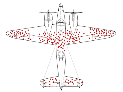
We need more armor Jim! (figure taken from the wikipedia page)
A practice like this would inevitably lead to ineffective solutions (extra armour on those areas would pose minimal benefits, if any at all), and essentially no change in the survival rate of the planes. I should instead reinforce parts of the plane that were not damaged, because those should be the most critical for the keeping the plane in the sky (cockpit, engines, the middle of the wings, etc).
Another example of a biased data-set is when asking questions to non-representative parts of the population. For example, we shouldn’t be asking about alcohol consumption during the local Beer Fest, or about people’s favorite pie during an apple-pie contest. As you can imagine, designing a good field study is tricky and requires a lot of effort. That’s why it’s better to leave this part to the experts.

So, Jim, are you a vegan, or vegetarian?
On the other hand, a too small data-set is also problematic. See the graphs below, they show the two possible outcomes of a fair coin-toss experiment. If we stop the experiment too early, we will most probably get the wrong answer (left). If we continue gathering data, then we will probably arrive to a better result (right).
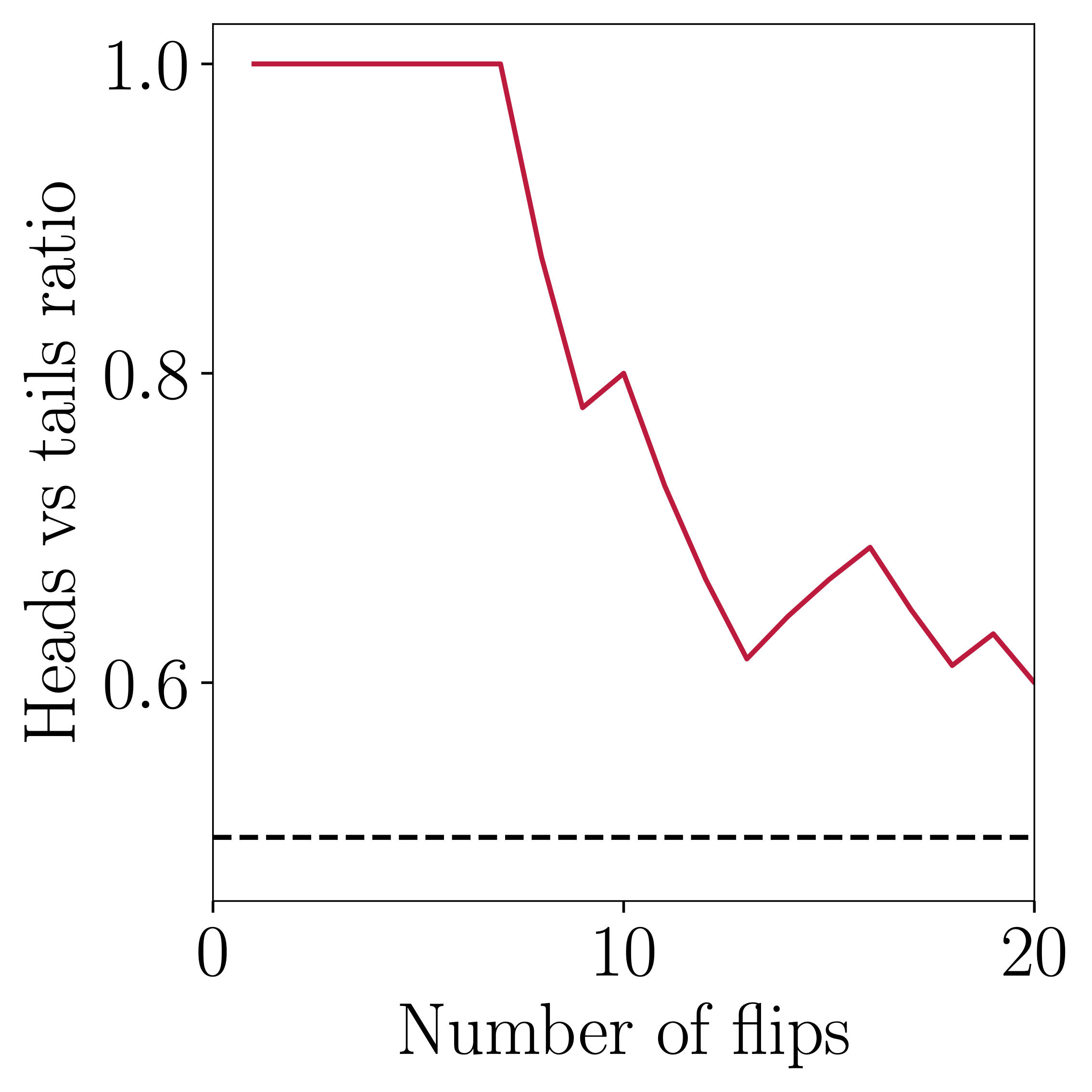
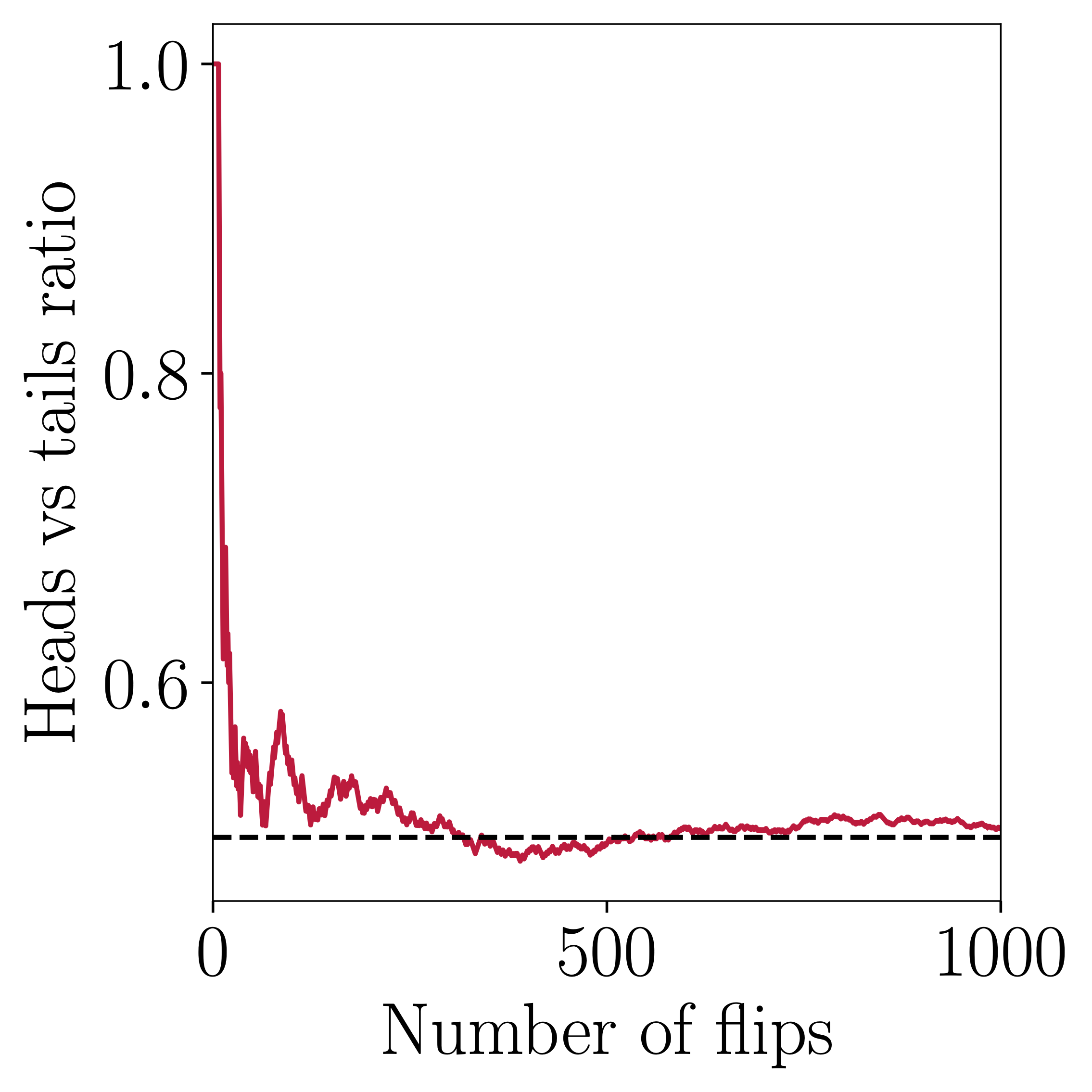
We need more coins Jim!
Considering the above, we can say that an easy way to lie is to just carefully gather our data sample (wink), and then produce a summary statistic that suits best our narrative. Or, from the opposite point of view: Before accepting a given result out of a study, we need make sure that that data used are not problematic. This is usually very challenging to do, because we may lack the expertise, the tools, or even access to the data. Thus, we need to rely experts and their supporting institutions. There are countless examples of academics, researchers, journalists, and their hosting laboratories, associations, universities, etc, that do excellent work with data gathering. Sure, mistakes have been made in the past, but I’d like to think that it’s all part of the learning process.
3. Abusing statistics
Malevolence score: ★★★★☆
Ah, one of my favourites… That is because it can be intentional or not, but it’s always more glaring when it’s the former! For the first case, it is somehow forgivable, because not everyone is really trained to interpret statistical measures of a given quantity. This is fine; we people make mistakes all the time… But it is just our responsibility to educate ourselves and others and be better!
3.1 Correlation is not causation
Sometimes we need some proof that A causes B, in order to take some action related to A, or just make a compelling argument during a discussion. Then, we usually resort to presenting some kind of correlation between A and B. Take for example the figure below:
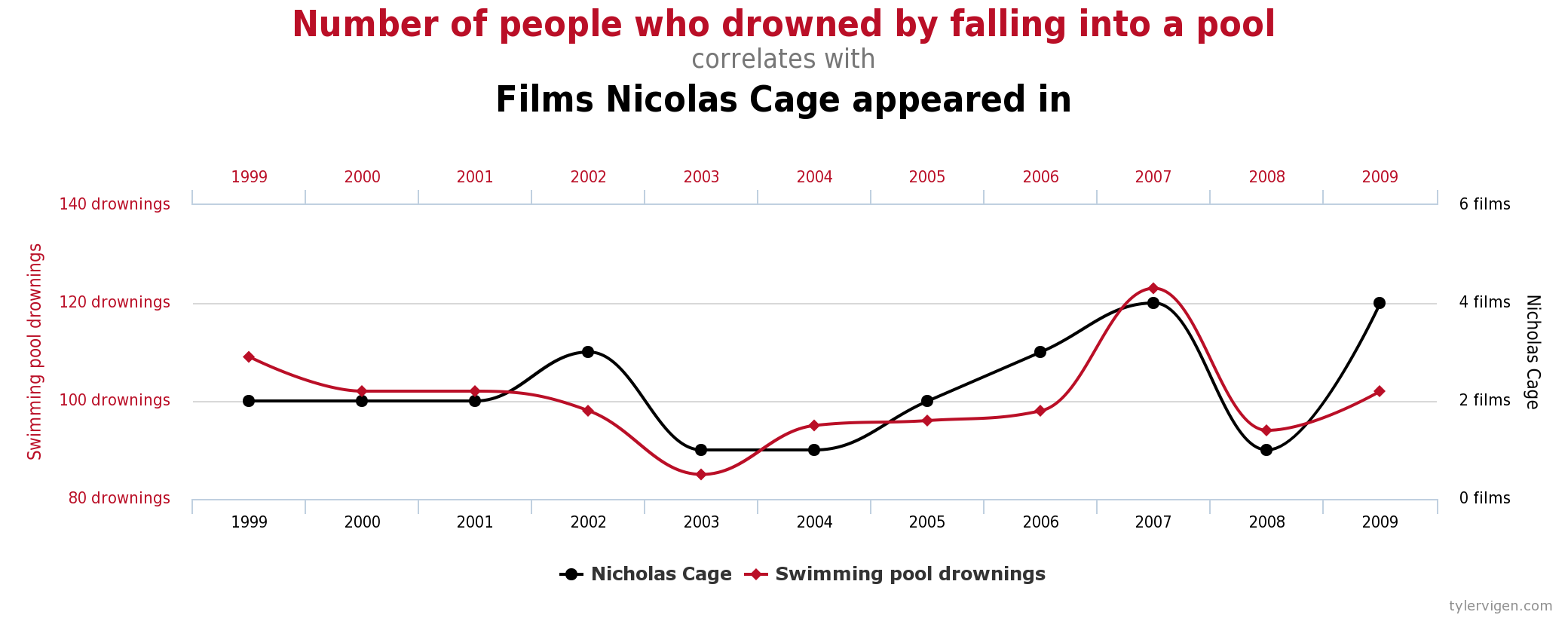
Is Nick Cage to blame here?
This is an example of spurious correlation, and I could not possibly imagine a causal model to connect the two measurements.

Although, to be fair, it's Nick Cage we are talking about...
In general, statistical models are difficult to write down, and sometimes challenging to interpret. There is a whole scientific discipline that tries to infer causality from statistical measures, and it is one of the best approaches we have in order to help us find meaningful connections between As and Bs. Unfortunately, some people choose to bypass all the caveats and just use the high-level information that suits their narrative.
You can amuse yourselves with more weird correlated data-sets here.
3.2 Summary statistics
Quite often, in order to get our point across we use high-order summary statistics. We say, for example “the mean household holds X% of that”, or “a typical local man always goes for the A option”, or “more people prefer Y rather than Z”, or in worst case scenario “Those people from X country / region / ethnic background are responsible for our problems”. These statements should be fine in principle (apart from the obviously racist one), but the danger is that the big picture can be blurred under single-number measures.
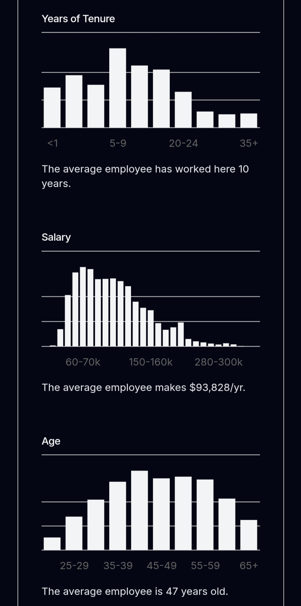
Take for example the quantity of the mean household income, which was estimated at around 80 k$ for 2014 in the US. Just by this number alone, one may arrive to the conclusion that the “typical American household earns 80 k$ per year”, which might not be completely true. To get the full picture we should study the picture below, which shows the actual distribution of income across the population. We notice that a very large number of households earn much less than 80 k$, which means that the “typical American family” is unfortunately a bit poorer than initially estimated. So, what is happening here?
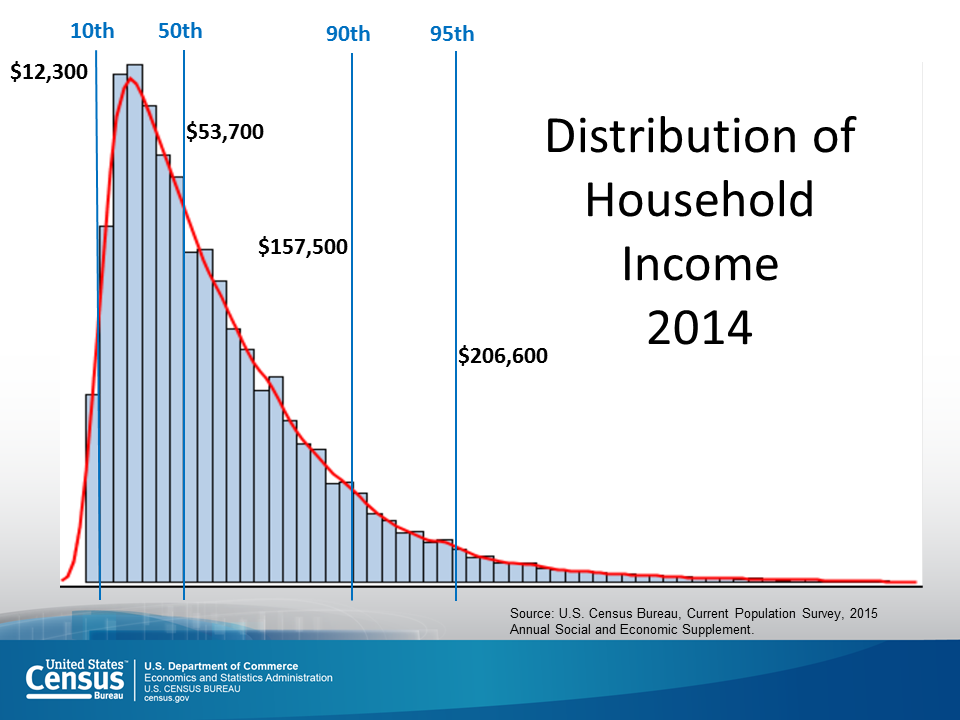
Upon close inspection, we find out that the mean as a quantity may be biased due to highly skewed data. The high- and very-high-income families, even if fewer in actual numbers, have disproportionately larger earnings than low-income households, and are thus biasing the measure towards higher income values. The median, which is more robust against data outliers, is preferred in these situations. See figure below for a comparison between mean and median estimates.
![Mean vs Median [from Wikipedia]](https://upload.wikimedia.org/wikipedia/commons/thumb/5/5c/2022_Average_and_median_family_income%2C_by_age_-_US.svg/1600px-2022_Average_and_median_family_income%2C_by_age_-_US.svg.png)
In summary, we should always be careful with high-order statistics. When in doubt, we need to go back and look at the (distribution of the) data! Next time you hear someone claim that “I think that the average X person is much better in math than the average Y person”, try to think about the possibility that this claim might have been based on a highly-skewed sample.
As a side note: Statistics is a scientific discipline that helps us make sense of systems where its components interact with each other in complex ways. In the above example, even if the statement of “X people are better at math than Y people” is true, we would want to know why X are so good at math. We now know that there are several factors that might contribute, such as family income, place or residence, or the overall public education system.
3.3 Hacking
When cheating, we can be imaginative. Highly technical details are hard to spot, and are many times hidden under layers of technical procedures. “Tweaking” some minor detail here, or “fixing an effect” there, can have considerable impact on the final result, which is no other than the single metric we report on scientific papers. Experts are usually able to spot those things, but sometimes replication of the whole analysis procedure is needed! However, the problem is that replication does not bring $ or fame, and therefore is quite often ignored, or completely omitted altogether. One might argue that this system is far from perfect, but so far it’s the best we have. Eventually, malpractices in science are discovered, and people face the consequences (see section on direct data manipulation above).
3.3.1 How fitting?
Sometimes, it’s quite straightforward to get easy answers out of the data. Patterns might be easy to spot, and therefore the connection between measurements is evident. But quite often this is not the case. Our measurements might be noisy or problematic, our models might be useless, or our analysis methods too naive. This may happen in science as well, where we are pressured to provide a single final answer for a given study or big question. Then, we might rush our analysis and present something like this:
Fitting a straight line through a cloud of points is easy, but also pointless. Any numerical result out of this model would contribute very little to our understanding of the data. On the other hand, using a model with a million parameters is also not appropriate, because it would create overfitting issues. This means that we have defined a model that fits almost exactly the particular data set, but would most probably fail to generalize to a different data sets (the opposite of overfitting is underfitting).
A relevant problem to the ones above, is when failing to recognize hidden patterns in the data and thus extracting the wrong conclusion: Sometime ago I heard that alcohol consumption might increase performance in developing software, so I declared to my colleagues “why not try this experiment, should be fun”! The result is shown in left panel of the figure below, where as you can see, alcohol consumption did not significantly affect my performance. My colleagues seemed to have a different opinion though, because they were constantly complaining about the quality of my work. This can’t be right! I have data to defend my case! Well, upon closer inspection, the result completely changes after properly grouping the data! You see, my C++ skills are disproportionally higher than those of Python. This causes a certain pattern that is challenging to see at a first glance.
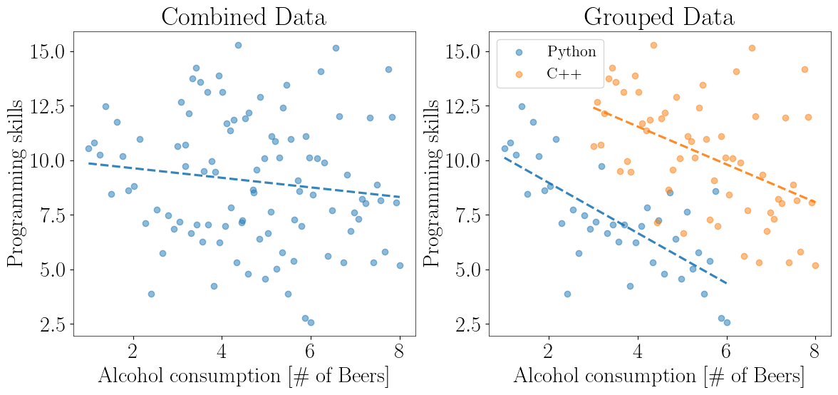
This situation describes the so-called Simpsons Paradox, which very often is the cause of misinterpreting the data. The first example from real life comes from the famous Berkeley case.
We constantly encounter these kind of problems in Gravitational Wave Astronomy! Our Gravitational Wave detectors (see here for our current ground-based ones, of here for our future space observatory) detect different types of waveforms, and we need to carefully model them in order to extract them safely from the data. More of this in a future post!
3.3.2 p-hacking, a special category of hacking
In statistics, we need to use metrics in order to decide between two competing hypotheses (yeah, science!). In classical statistics, we have been using what is called the p-values. We begin by inventing two categories: The H0 is the so-called null hypothesis, which usually refers to the negative relationship of the particular effect, i.e. “There is no signal present” or “There is no difference between the two populations”. H1 is the opposite. So, “the p-value is the probability of obtaining test results at least as extreme as the result actually observed, under the assumption that the null hypothesis is correct”.

Yeah, this was not very helpful, I know...
In a nutshell, p-value calculations assume that the null hypothesis is true and use that assumption to determine the likelihood of obtaining your observed sample data. p-values answer the question, “Are your sample data unusual if the null hypothesis is true?”. At best, p-values indicate the degree of compatibility between a dataset and a particular hypothetical explanation (such as a null hypothesis), which is usually not the question we would like to answer. At the same time, we have adopted a particular threshold (the infamous 0.05) which is somewhat arbitrary. Finally, the p-value does not indicate the size or importance of the observed effect. A small p-value can be observed for an effect that is not meaningful or important. In fact, the larger the sample size, the smaller the minimum effect needed to produce a statistically significant p-value.
All the above may sound as me bashing on p-values, but the truth is that they are super useful and helpful towards understanding our given problems. The point is that the interpretation of statistical quantities is most of the time quite challenging. A single reference to a high-order statistic such as the p-value does not convey the full picture.
The final takeaway message is that hacking can be hidden inside the technical details of the given study. This is sometimes very hard to spot even by experts, and that’s why replication is a very basic ingredient of science!
Summary
Nowadays, data is a kind of modern currency. They are extremely valuable because by studying them we can tune our decision-making process. But they can also be used to mislead, or directly support flawed claims and malicious causes. Therefore, it is more necessary than ever to educate ourselves with the basics of statistical sciences in order to be able to assess the quality of the information out there. Unfortunately, statistics is not very easy, but that’s life. In my humble opinion, I think that the experts need to be alert and react to blatant lies that use faulty data or methods. And this is crucial when those are used for decisions that impact the everyday life of all of us.
4. [Bonus] It’s all about presentation!
Malevolence score: ★★★★★★★★★★★★★★★★★★★
I left the best category by far as a bonus point at the end. When data cannot be forged or manipulated, people resort to simply presenting them in a way that is convenient for their narrative. This includes tricks like zoomed-in axes, using two axes to overlay data that shouldn’t be shown together, “enhanced” bar and pie charts, or directly forged data-points on plots.
Then the question arises: Why do such an obvious manipulation? Eventually people or companies that use such cheap tricks are caught and often publicly called out… Well, again, for the n-th time, because first impressions matter, and consequences are often too mild to outweigh the benefits!
So, let’s play a game: In this section I have collected a few screenshots from the news or social media. You can try yourselves to spot the visual trick used in each of those figures (some hints are given). Enjoy!
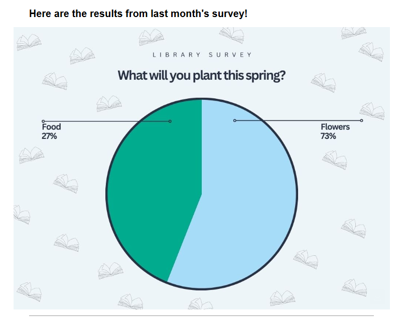
Hint
Plot enhancement, because why not?
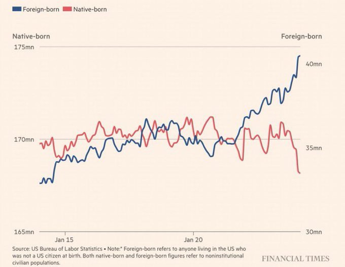
Hint
Double axes, plotting absolute numbers of different populations. Needs normalization before plotting.
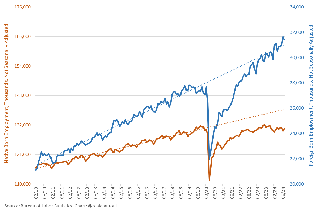
Hint
Double axes, as above. After normalization the trends appear to be similar.
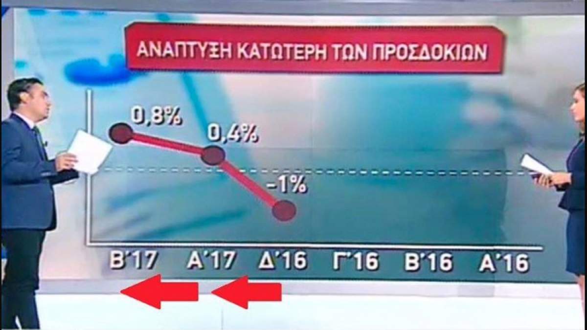
Hint
Check the x-axis. Gives the impression of decline of the development index in time.
Hint
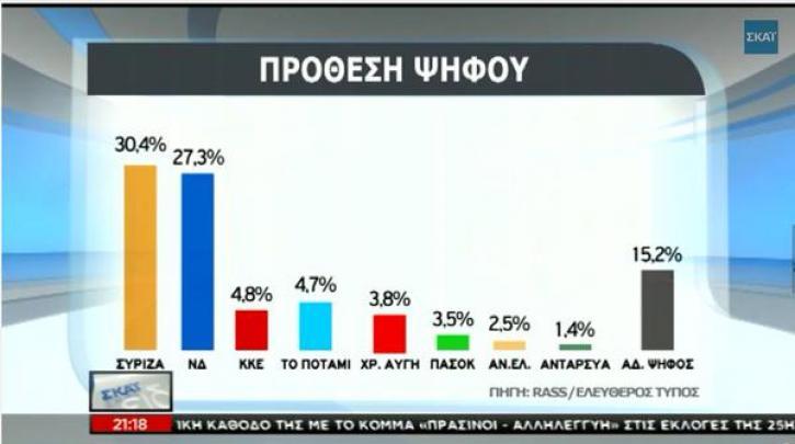
Visual enhancement of bars here... Taken from Greek news channel.
Hint
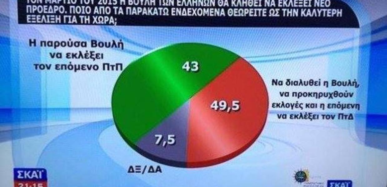
No comment... Taken from Greek news channel.
Hint
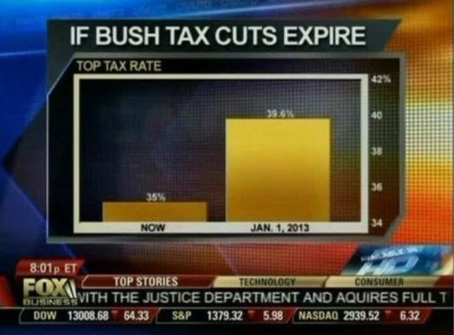
Bar enhancement, zoom-in to give the impression of larger difference between bar heights.
Hint
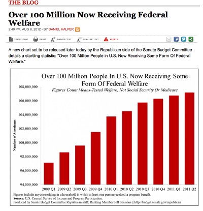
Bar enhancement again, can you spot it? Look at the y-axis!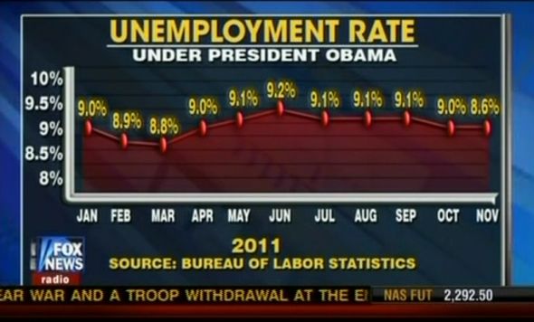
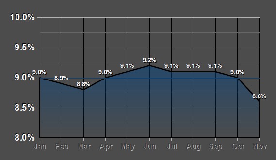
What is reported is shown on the left, a plot of the actual data is shown on the right.
Hint
Can you spot the difference?